HARING — MAFF

REBRANDING HARING FOR ARTIST FRANK STABEL
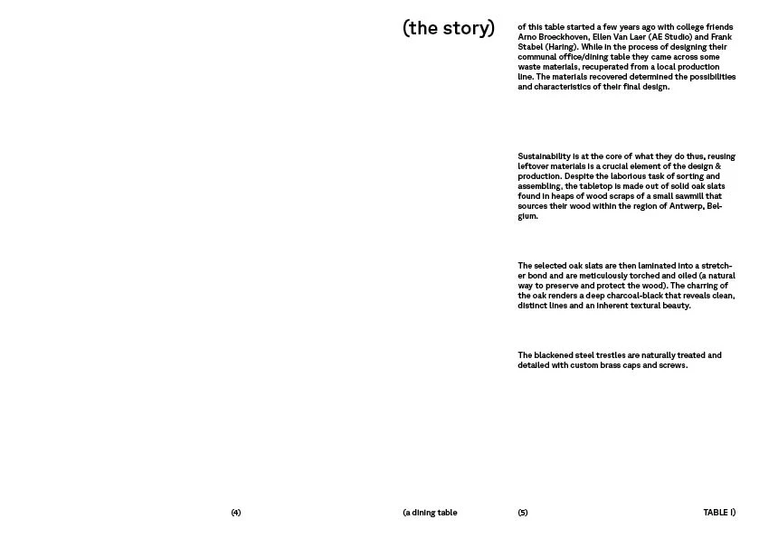
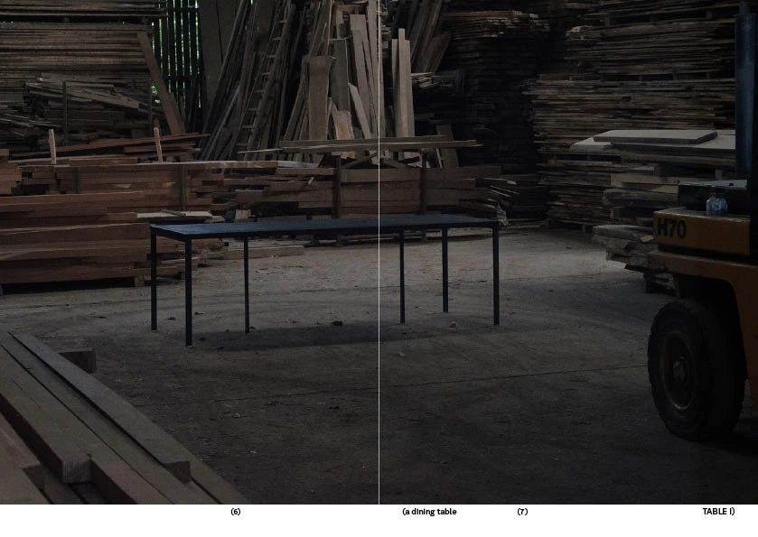
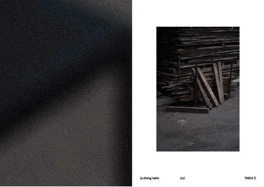
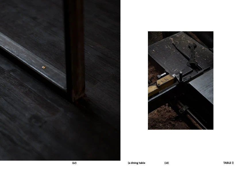
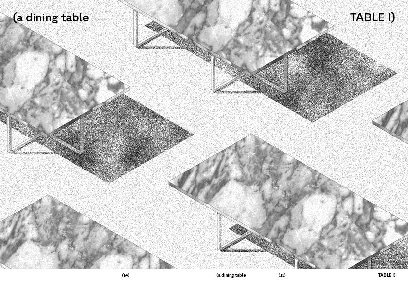
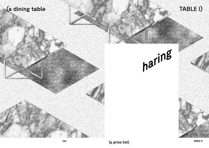
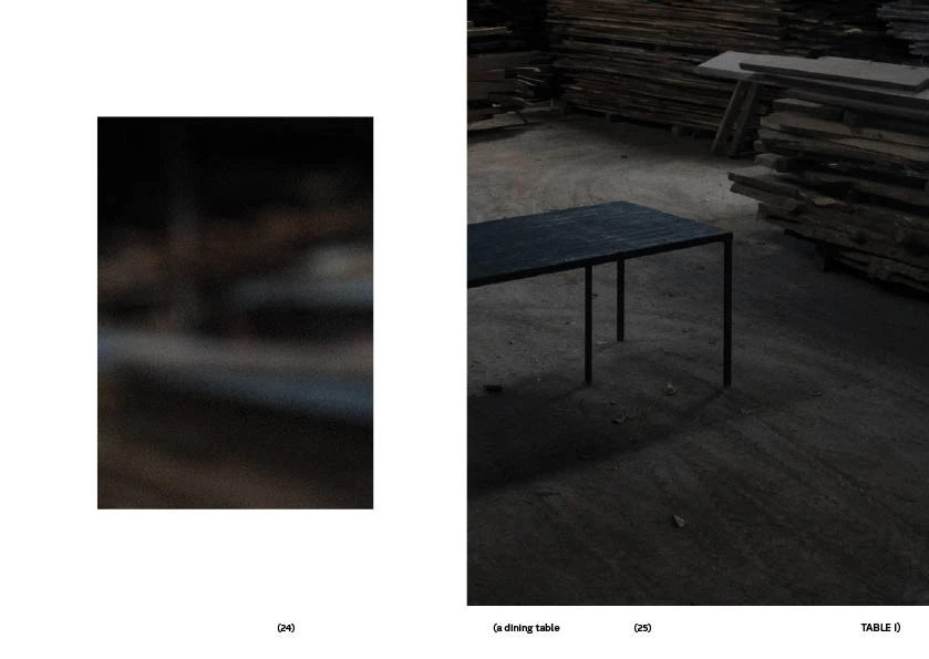
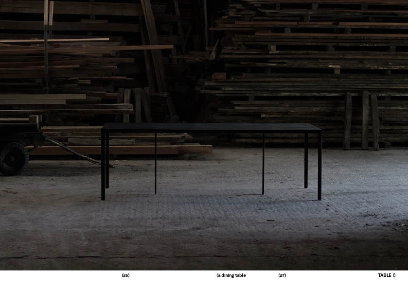
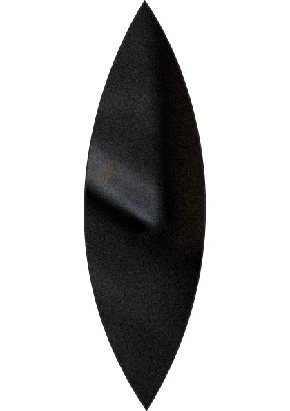
For the rebranding of Haring, existing imagery was translated into abstract graphic forms, distilled into a tactile visual language rooted in reduction.


Frank Stabel’s work consistently searches for essence: stripping forms down to their core structure, removing the unnecessary and revealing what remains when everything else falls away. The identity follows that same principle: distilled, tactile and direct.
The use of GT Planar subtly echoes the isometric perspective often present in his drawings: a typeface that leans, stretches and shifts tension without losing balance, much like the work itself.

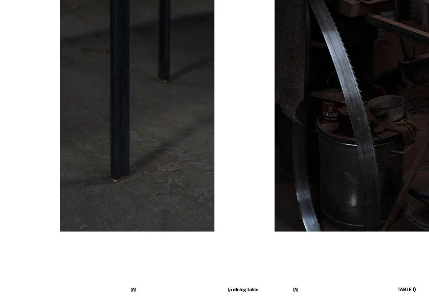


CLIENT : Frank Stabel, Haring
art direction and graphic design : elke treunen